That was the rationale behind our Trulia Hindsight movies (show something about everything) and our charts of a day of activity on Digg. It's definitely an approach I've found easiest in Processing, although using it recently I've missed the instant mouse-driven interactivity of Flash or HTML.
My colleague Shawn just posted a visualisation he made to help debug a visualisation he's working on at the moment:
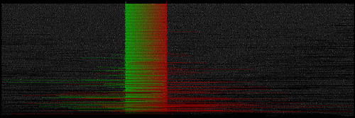
Shawn's chart is basically a simple scatter plot of cabspotting data points (by cab ID and time), except that he's also overlaid some of the connections between the data to show how far back and forward he has to look to accurately predict a cab's location. And the whole thing moves beautifully, showing up bad data and highlighting good data as it goes. Hopefully we'll get a video up soon.
In the meantime, be sure to read Shawn's description and keep an eye out for the final debugged visualization in the MOMA soon!