I've had a slow debate running with mySociety's Tom Steinberg since Euro FOO '06 about the best way to present travel time mapping, after we compared notes from my travel time tube map for London and the work Chris Lightfoot did on mapping transport travel times in the UK as a whole.
It seemed like the best way to settle this debate would be for mySociety and Stamen to work together updating their maps and see if we could get the best of both worlds. MySociety had comprehensive travel time data that they, uh, acquired from Transport Direct and Transport for London's journey planners. They also had an ace up their sleeves with the purchase of house price data for London from the UK's land registry. So far the volunteer-led map design had come up with strong proofs of concept, but a consistent set of presentation material was needed to make a compelling argument about the usefulness of these maps in the general case.
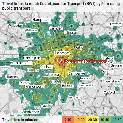
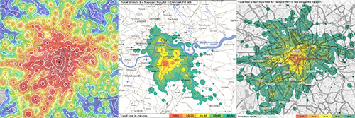
Our initial attempts to update the map began with a couple of days of Tom Steinberg and I alternately hunched over Photoshop and poring over the Edward Tufte books (passages recommended by the man himself) and looking for an appropriate colour gradient to represent travel contours (I didn't know about this resource at the time). All the while Francis Irving was back in the UK working on the heavy lifting behind the project, getting the data gathering and overlay rendering up to speed. We tried a few different things, but actually I thought that the palette Tom had worked on with mySociety volunteer Richard Pope was pretty good, and that's the one we used for these static contour maps. (Early mySociety results on the left, updated one in the middle, my final one on the right).
These maps got much less satisfying with the addition of the house price zones, however. That was what Tom had originally asked us to help with; a thorny problem that needed a new approach. After poking around with the various two and three colour overlays with my colleague Mike it became clear that the combinations of masks and outlines were immensely confusing to work with. In addition to this problem, Tom and Francis at mySociety wanted to be flexible about the most appropriate configuration of house prices and travel times to tell a convincing story about the data later. My initial plan had been to set up a workflow in Photoshop to quickly produce the image files they needed. As the complexity of that task became clear, it got less and less attractive.
I had been resisting reaching for a programming solution to the design and cartography problem, but it became clear the manual processing was going to be onerous and difficult to keep consistent. So I asked Francis to provide me with a house price overlay that displayed small price increments using a grey-scale gradient, instead of solid colours between large price bands. Then whilst Tom Steinberg was out at a meeting I cooked up a quick slider experiment in flash to see if the approach had merit, and the difference was astounding. From that moment I was hooked on giving everyone access to what we were playing with, even if it meant working on it over Stamen's christmas break (time/budget constraints had already excluded building a slippy Google-Maps-style map, for example).
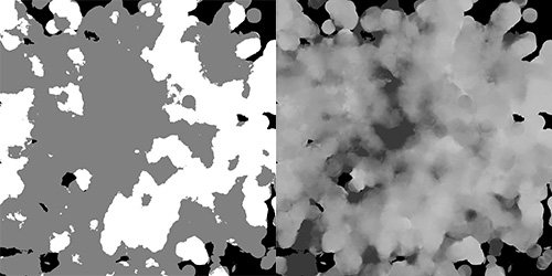
Here's a picture of what the house price masks looked like at that point, two colour bands on the left (constrained, harsh), and the new small price increment one (cloudy, beautiful) on the right:
The next task focused on getting a consistent set of base maps for the work, rather than using a hotch-potch of Ordnance Survey maps. The OS maps are world-class for accuracy, of course, but the cartography changes radically at each different scale and the maps aren't designed for on-screen viewing, let alone for data presentation. Naturally (given my history with the project) we turned to OpenStreetMap as a data source and asked Nick Black from ZXV to help produce maps that would be a drop-in replacement for the OS maps mySociety had been using so far.
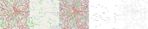
One thing that Nick's involvement got us was separate layers of data (above), which let us get more fancy with the presentation later on, and keep the labels on top of the data. Of course flexibility giveth, and flexibility taketh away: later on, it took me a while to figure out how to get the text rendering in Flash to match the mapnik style Nick was providing us (more on that later).
So, armed with new map layers, gradient overlays and masks for travel time and house prices, I set about creating a Flash piece that Tom and Francis could configure for themselves (and they did). They're tough cookies to please, of course, and getting something ready that we were all happy with (on volunteer time, across an 8 hour time difference) took patience on everyone's part. Looking at the finished pieces I hope you'll agree that it's worth it, and if you happen to be a transport routing expert sitting on a system that could help produce these maps for everyone, working around the issues Francis identified, then I hope you get in touch!
I have to leave this post here for now, but I hope to go into more detail about the Flash code (which is over here, under a BSD license) in a future post.