I won't address his specific criticisms of Blocks here because agree with a lot of them and we're working on improvements that should go some way to addressing them. However, I do take issue with beginning criticism of the piece using the "standards of canonical information visualization". This relates to the uselessness posts Mike and I made earlier in the week.
Mike_d calls me out on my Techcrunch comment, suggesting that I want both useful and useless at the same time:
No offense to Tom, but it sounds like he's playing both sides! He admits to its potential uselessness but simultaneously suggests that that it is quite functional. Based on Stamen's previous work, I do think they are trying to produce useful information tools and not just pretty designs, but justifications like this seem like an easy way out of more careful consideration of their design. And frankly, the "works for me" defense seems completely antithetical to the principles of information visualization!
I really don't think I'm playing both sides here. Unfortunately, when I respond to people who think Blocks is useless, I'm conceding terms and fighting an uphill battle to make my real point. Perhaps that's a mistake (and yet here I am again).
I think that people who insist on evaluating Blocks as a tool - and conclude that it's useless - are wrong: I've found it useful myself, hence the "worksforme" comment on Techcrunch. But what I really think is that they're looking too hard for the purpose and utility of it before appreciating that it's really a way to look at Twitter from a different angle. I don't think it needs to start from a position of usefulness to be interesting. Furthermore, it's not that it is/isn't useful, it's whether utility is the guiding concern. For us (with Blocks) it wasn't.
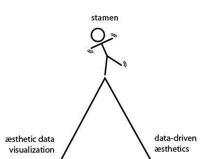 (image by Mike, illustrating my words, as a response to Alexandra Deschamps-Sonsino's post)
At Stamen we're knowingly operating on a fine line between aesthetic-driven visualisation (effective information visualisation that is also beautiful) and data-driven aesthetics (beautiful things that also represent data). It's a largely unexplored line (perhaps the area that Mike_d's first post has identified as emerging) that I would compare to the line between designer/coder that I comfortably and steadfastly occupy every day.
Fundamentally though, Blocks is a visualisation of Twitter and its users for Twitter and its users, by Twitter and its users. We have made an attempt to make it understandable for people who don't use the service, but that's a hard task and it's confounded if you're looking for something that's not there.
There aren't really any metrics there, just the things that people said in the order that they said them. Squared.