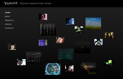
Yahoo's new design research outfit, apparently also known as yhaus, have just put up a site outlining their work so far. The first thing I noticed is that they've snagged an amazing subdomain: design.yahoo.com. The second thing I noticed is that compared to other teams I'm aware of in the field (including Stamen) they have a pretty good gender balance (a thorny issue but I'm noting it anyway). The third thing I'll note is the guest appearance of non-Yahoo work in the portraits of the team: I see Torrent Raiders, Fidg't... what else?
Sadly, all but one of the demos there so far is a big Quicktime movie. I know that with millions of users Yahoo has to be a stickler for browser support and compatibility, but I hope they get a chance to take this work live on the web as well as demo it in movie form. There's some solid realtime Flash and Processing work hiding in there, and people (OK, I) want to see it in its interactive entirety.
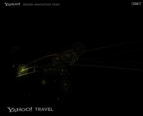
There's clearly some healthy collaboration and influence going on there (much as in our work, e.g. Ben Fry's zipdecode looms large over the interactive version of our Trulia search animation). Yahoo's Aaron Koblin is best known for his Flight Patterns piece, and this visualisation by Michael Chang of Yahoo trip planner data is very similar:
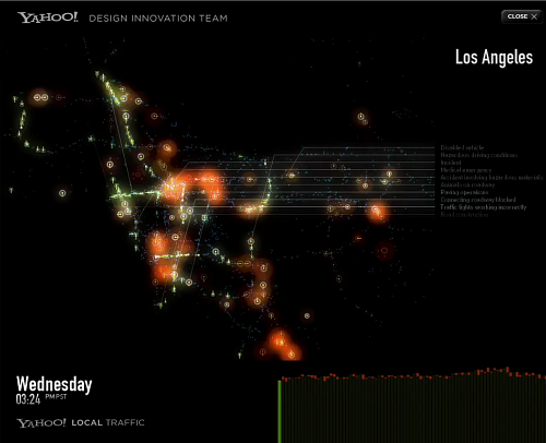
Likewise, Aaron's work on traffic patterns bears a close resemblance to Flight Patterns:
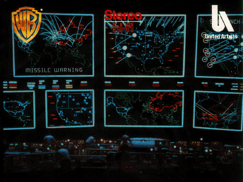
I don't want to pick on them too much, because it's really beautiful work I admire a great deal (and it might seem like sour grapes), but both the pieces I've highlighted do suffer from something we've tried to avoid at Stamen: animated information graphics on top of black backgrounds and vector maps can easily look like screenshots from a modern-day War Games:
I'm glad other people as well as us are experimenting in public, and I'm glad sites like Infosthetics and Visual Complexity are cataloguing our efforts. We need our own visual language around this kind of visualisation that doesn't resonate with the imagery of war.
Apple's iphone has made a strong impression with slick transitions in its interface design, but the maps application still borrows from Google's pseudo-shadows and static pins. The playful interfaces of the Nintendo's Wii games certainly offer a different path, but the rest of the games (and movie) industry's cinematic-realism aesthetic exerts a strong influence over our generation of designers and it isn't going to meet these goals any time soon.
It's a fairly regular topic of conversation at Stamen: how can you make a visualisation of e.g. 911 calls actually look like emergencies, and not birthday parties or toilet flushes, without freaking people out and without making it mundane? Is it possible to use great circles to connect air travel destinations without it looking like missiles? Can you animate growing and shrinking red and yellow circles on an aerial map without it looking like Gulf War I weapons company propaganda?
It's a bloggy weekend here at Random Etc, if you're reading along I'm definitely interested to hear your thoughts.