First up, Twingly, which I think is a Swedish blog aggregator/search site of sorts, but I came across it as a screensaver video on YouTube:
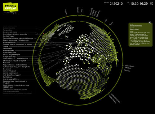
The person who posted it to YouTube helpfully describes the blogosphere for those of us not in the inner circle:
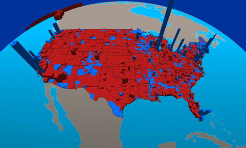
"The blogosphere is the total sum of all blogs connected into a social network. The term was cool a year ago but is too widespread now for the general blog crowd to use it. But since it's actually a useful term it is still referred to by the inner circle. From there it will work it's way back into the common language, acheiving a renaissance around febtuary next year."So that's cleared that up then. Next up, an academic one, G-Econ from Yale (via Things Magazine), which plots geographically based economic data:
I admire their thoroughness in doing the whole world (check the site for country by country breakdowns), and their multi-megabyte eye candy movies. It's a shame it's all based on a GDP-like measure, which isn't the most intuitive or easy to visualise thing itself. I'm reading their papers now to see what the story is.
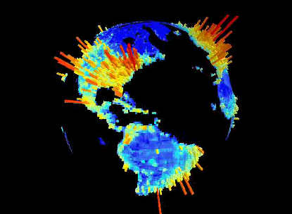
Lastly, I'm really pleased Dan Catt over at Flickr/Geobloggers can't resist plotting his interestingness heatmaps in 3D inside Google Earth. When the sky goes pink you know it's because Yahoo's Dubai office decided to build it for real.
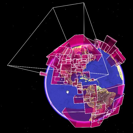
Update: Eric found this one from ESRI: