So it's not IM, SMS or the web, but it talks to all three. I like it. I want to hate it. I suppose I cheat, because I don't let it SMS me very often. And maybe because most of my contacts are a continent away, so I only get a few messages a day (they're all asleep). But there it is: I'm not stressed out by it, I'm still Getting Things Done (though that system's not for me, yet). Continuous Partial Attention be damned.
Of course, it's fully Web 2.0 buzz-word compliant, so it has an API that you can use to get data in and out. Not a super-useful one for visualisation, but useful enough to get started. Knocking some ideas back and forth at Stamen with Eric yesterday I decided it was worth trying his idea of plotting twitter activity on a circle. I started with a circle representing the previous 24 hours, rather than a 12 hour clock face, for several reasons:
- we wondered if there would be obvious patterns to spot, for example between our European and American friends
- the Twitter API only gives you the previous 24 hours of activity
- if a whole day fits in one circle, then circles can be overlaid to compare days
- Eric wants to make coasters of our visualisations... shh!
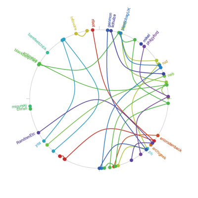
Given 24 hours of statuses I assigned each user a colour and plotted the status at an angle corresponding to how much of the day had elapsed. I joined each message to the previous message from that person, if there was one. Here is how my first pass turned out:
And here's another variation, still with a colour per person but ditching the arcs and instead using concentric rings for status messages. There are small dots again mapped to time of day. Moire be damned.
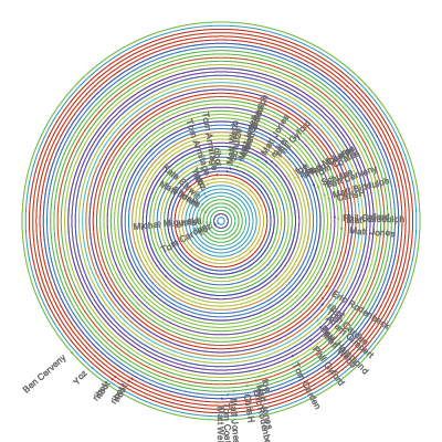
The top of the circle is midnight (PST), the bottom is noon. The data was sampled at about 4pm. I'm not sure where this circular/spiral visualisation is going, but if I revisit it I will probably unroll them into a rectangle in the hope that there is space to draw and read the messages. After all, the messages are what it's all about.
These were built with Processing, using the now-built-in XML support and the gorgeous PDF library. I haven't posted the applet because it doesn't work online with the Twitter API, sorry.