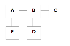
My first example can be drawn in 2D like so:
Plotting these relationships in 2D, or 3D space is known as graph embedding, and finding useful ways to interrogate them is an intriguing problem to think about. Indeed, it's a research field in its own right. Graphs are well understood data structures and many tools are available to manipulate and analyse them (e.g. GraphViz). One reason for this is that they are the cornerstone of many computer science problems (and solutions), but also because they can be used across many different disciplines. The ubiquitous application of graph theoretical methods across many scientific disciplines is the main subject of recent popular science books such as Linked and Ubiquity.
Social Network Visualisation tends to borrow heavily, if not totally, from graph theory. Having looked at several examples of this over the past year, I've spotted some common pitfalls which I'll try and articulate here.
Graph Visualisation Pitfalls
On Flickr, we can easily find out if A knows B by looking to see if A has listed B as a contact. But listing of contacts is tied up with all sorts of other practical considerations. The main reason A adds B as a contact isn't so that we can use that data for social network analysis, unfortunately. On Flickr, it says A knows B, or A likes B's photos, or A chatted to B in the forums and might want to find them again, or B added A (for any of these reasons) so A was being polite and reciprocated, and so on. Not all connections are made equal.In reality A might have anywhere from 0 to 500 contacts. As the average number of contacts creeps upwards, the naive attempt to draw the graph falls over. My ASCII art attempt would be screwed as soon as there was a group of five mutual acquaintences. Even with the assistance of mature software like GraphViz, the network of X knows Y is too dense to draw clearly. The not-a-tree problem is faced by many network visualisations. There are probably too many connections to graph.
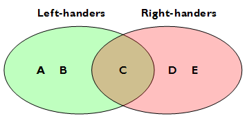
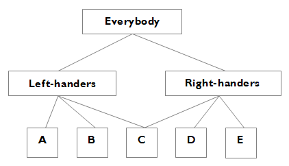
For many of us, it's intuitive to visualise these relationships as a tree. This cluster is connected to that cluster, and people are either in one cluster or another. Clusters probably have sub-clusters. We can handle these kind of relationships easily, but unfortunately they fall down straight away when presented with real data. For example, grouping people by handed-ness is a trivial example of something which generates overlapping sets. Imagine A and B are left-handed, D and E are right-handed, but C is ambidextrous. We aren't dealing with heirarchical clusters, we're dealing with overlapping sets.
A knows B, B knows C, C knows D. What's the connection between A and D? If we're analysing a terrorist network, then we might have found a potential link which is worth investigating further. But if we're trying to recommend photography or music or web-links to A, should we include D's tastes? If D is C's drug dealer, and B is C's little sister, and A is C's elderly next door neighbour? Probably not. Connections aren't transitive.
Show Me The Eye Candy Anyway
So assume we're aware of the above caveats, and we have a densely but ambiguously connected graph of contacts. The main task with this kind of visualisation, once you have the data, is how to display it in a readable format. It's almost certainly too much data to just throw out there (but it's always worth a try), so how do we prune it down to show only the meaningful stuff?On Flickr, GustavoG has been busy producing graphs of the mutual contacts and testimonials networks. You can see them all in his FlickrLand set. These are interesting to examine for many reasons, not least in how he has pruned the network in order to get manageable visualisations from it. The whole social network on Flickr would be too big to show in detail, so Gustavo doesn't show it all. He rightly spots that testimonials should indicate fairly strong ties, and the network is much sparser than the contacts network. He's also attempts to trim the constacts network down by set the requirement that contacts must be mutual for a graph edge to exist, and he's tried different thresholds for how many mutual contacts a person must have before they are added to the graph.
Gustavo has used yEd, a Java graph layout program, to produce graphs using the "organic layout", and it works pretty well. In particular, in certain graphs there are undeniably meaningful clusters to be found, ones that expert users can spot straight away. At 50 mutual contacts and 100 mutual contacts in particular, the clusters are pronounced. At 10 mutual contacts the network is too dense to be very meaningful - certainly as it's presented at the moment it doesn't say much at all. At 200 mutual contacts, it tells us what many regulars to Flickr already know - there are only a few very well connected folks, and they mostly know each other. Because testimonials indicate stronger ties, the overall network is very fragmented, leaving many loose mini-clusters. Nevertheless, the overall picture is surprisingly well knitted together.
FlickrGraph
Gustavo's method for making the data manageable is to remove nodes which aren't significant in the overall picture. For instance, in mapping out clusters of users on Flickr, it's probably not a big deal to lose people with less than 10 mutual contacts. Marcos Weskamp recently used a different tactic to cut down the same data - remove edges, and only show a subset (window) of nodes at any one time.Marcos's FlickrGraph is fantastic to play with - the interactivity and clean design help there - but unfortunately it is less meaningful than Gustavo's static graphs.
The FlickGraph suffers from the data source because the current Flickr API will always return contacts sorted by user-id (an essentially arbitrary number). Because of this, and the limit of ten contacts shown, a lot of popular people won't appear to be connected to anyone despite the fact that they are.
Ways To Improve These Visualisations
Wanted: Richer Data.We already know how to get meaningful visualisations from our data. We have to start with meaningful data. Marcos Weskamp has demonstrated a neat way of graphing mailing list interactions with his Social Circles project. In my opinion, the FlickrGraph lacks some of the insight that Social Circles provides. This is partly due to technical implementation, but mainly because Social Circles is sourced from real interactions and implicit connections, not watered-down explicit declarations of interest. Flickr users like HyperBob are very active in the forums and comments, but don't keep contacts on Flickr. Social Circles-style data would capture that.
On Flickr, there are several implicit contacts networks we could use:
- Comments. A comments on B's photo. A-B could be an edge. A and B hold a conversation about the photo by comments. B-A should be an edge too.
- Favourites. A marks B's photo as a favourite. A-B is an edge. The edge length can vary depending on how many favourites A has, how many photos B has, how many of B's photos are marked as favourites by A, etc.
- Forum posts. A and B participate in the same discussion. A-B is an edge. The edge length could vary with the number of times they post in a single discussion, or the number of shared discussions they have.
- FlickrMail. As with forums, but this data is totally private, so I have no idea what it would look like or how to get it.
- FlickrLive. Who chats with whom?
- Page views. If A views B's photos regularly, but doesn't mark B's photos as favourites, and never comments on B's photos. (The privacy implications for this one are numerous - not least the fact that there is a reasonable amount of risque content on Flickr which people might admire but deliberately not declare an interest in, especially in an explicit way through contacts/favourites/comments or otherwise.)