I like this technique wherever there isn't an obvious feedback loop involved, but as soon as the size of the link drives its popularity which then drives its size, I think the utility falls down. This is illustrated best on 43 folders, where you have to try really hard to see past the 2 or 3 most popular links.
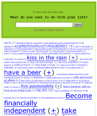
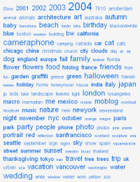
On Flickr, the technique is more effective for two reasons - the font size change is more subtle, and the popularity of a tag doesn't usually mean that it will attract more photos.
Everything2 has had weighted links for a while in the form of the softlinks which appear at the bottom of each article. (Softlinks are generated when someone follows a link from within an article, or if someone searches for something from the article page).
There are two variations, the regular view shows related articles - the lighter the link the more well-traveled the connection. There is also a 'chaos' view which sizes links according to how well-travelled they are, and shows everything associated with the article in question.
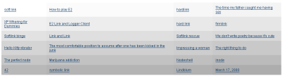
Softlinks are great because they allow anyone to link to relevant articles within Everything2, and illustrate what people are actually thinking about after reading an article. They're bad because they can easily be abused to cause offence, and mean ones tend to hang around once they're there - a sure sign that first arrivals get an unfair advantage and that positive feedback is tiliting the odds in favour of the already-popular.
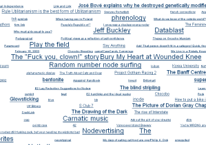
Note I'm not saying that rich-get-richer systems are always undesirable. They certainly promote stability, but positive feedback on lists isn't a great way to promote new-ness and I think that's a trap that some site designers fall into when using charts as an entry point for discovering content.